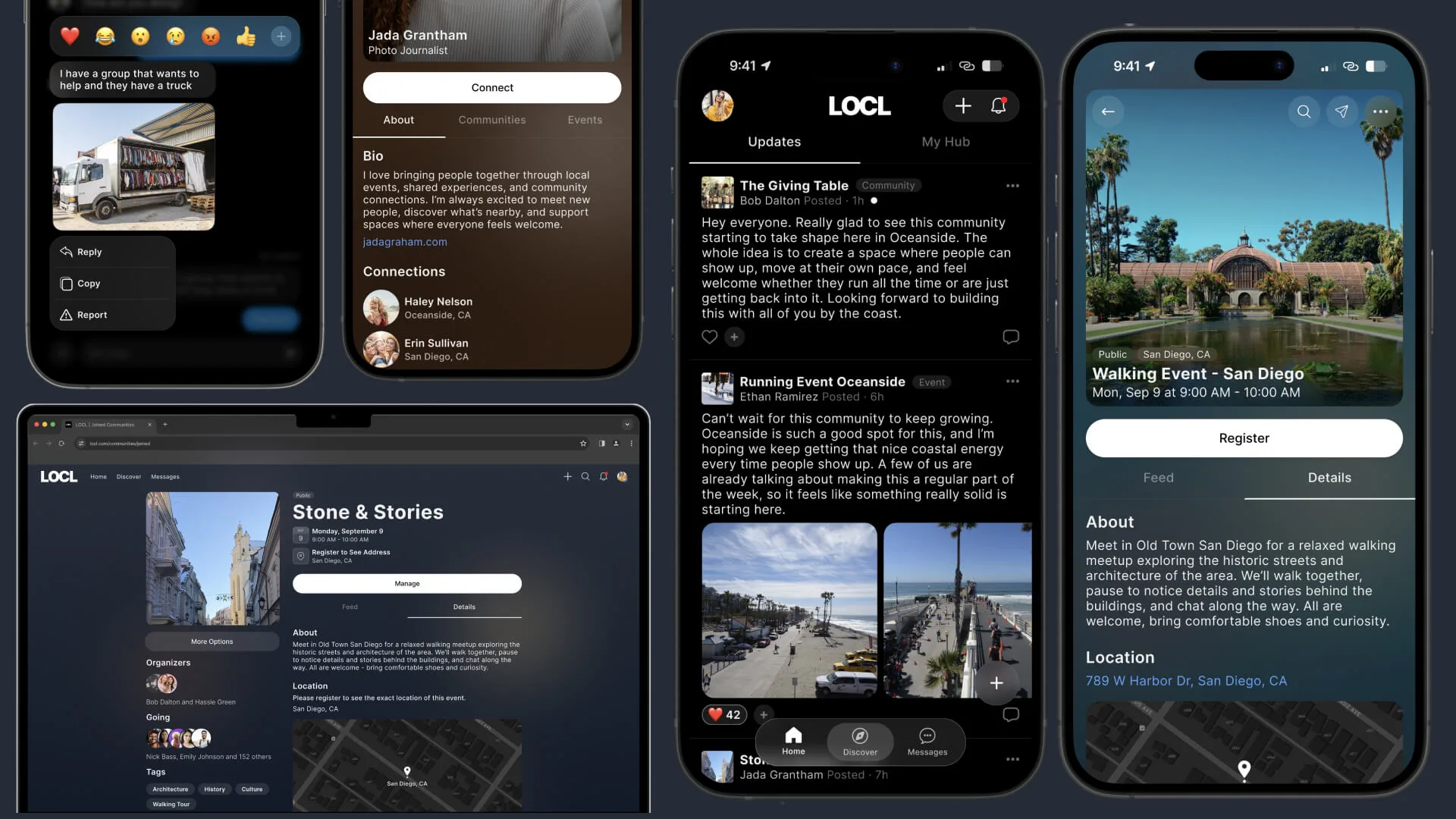
Designing a local‑first community platform built around real participation
Most social platforms optimize for reach, feeds, and engagement loops.
LOCL took a quieter approach: helping people find and participate in
communities that feel local, intentional, and worth returning to.
I led UX/UI and systems design across LOCL's cross-platform ecosystem,
shaping discovery architecture, governance UX, onboarding, interaction
systems, and cross-platform parity across iOS, Android, and responsive web.
Role
Lead Product Designer (End-to-End)
Focus
Systems Architecture · Community UX · Governance & Moderation · Cross-Platform · Interaction Systems · Discovery
Build
Flutter: iOS, Android, responsive web
Client
LOCL
Date
April 2024 – Present
01 — Impact Snapshot
What the work produced
↑Designed cross-platform community architecture across iOS, Android, and responsive web
↑Built governance systems including moderation, reporting, join requests, roles, and visibility controls
↑Structured discovery around local relevance instead of engagement loops or follower mechanics
↑Created reusable interaction systems that maintained parity across platforms while respecting native behaviors
↑Reduced engineering ambiguity through build-ready specifications, reusable patterns, and shared interaction logic
↑Early traction validated governance-first participation patterns, with strong growth in private and unlisted communities
02 — Context
A calmer alternative to the modern feed
Many social products are designed to maximize attention. More content,
more reach, more notifications, more noise.
LOCL focused on a different kind of community experience: helping people
find and take part in local communities they'd actually want to return to.
The goal was to help people find relevant local communities,
participate meaningfully, and give organizers the tools needed to keep
those spaces healthy over time.
That meant balancing four competing demands:
Openness and trust
Discovery and belonging
Governance and usability
Local relevance and scalability
The product needed to feel lightweight and socially alive while still
building the structural trust that communities require over time. Every
decision came back to that balance, from the navigation architecture
to governance flows to how communities surface in discovery.
The product, on both form factors
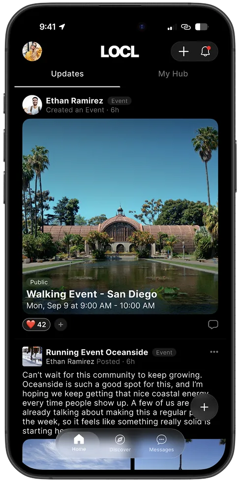
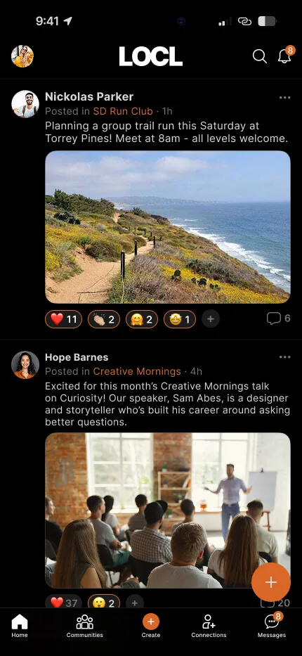
Home, Updates · Mobile
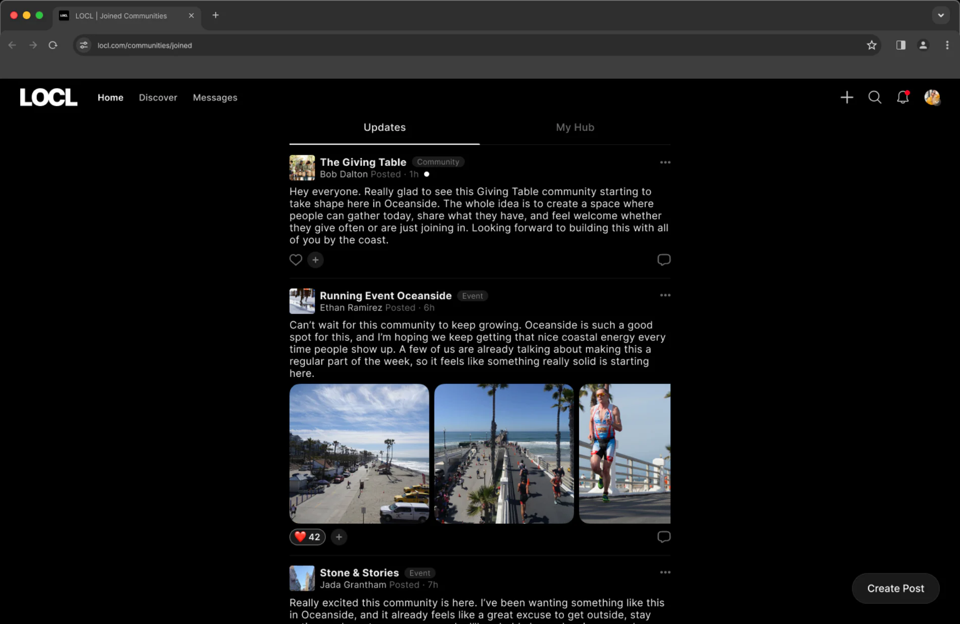
Home, Updates · Desktop
Home, Updates. The activity feed from every community and event you have joined. On mobile the feed owns the whole screen; on desktop it stays a single centred column rather than widening, so line length holds, and the space either side carries persistent navigation instead of more content.
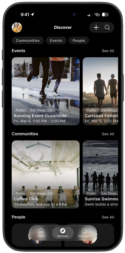
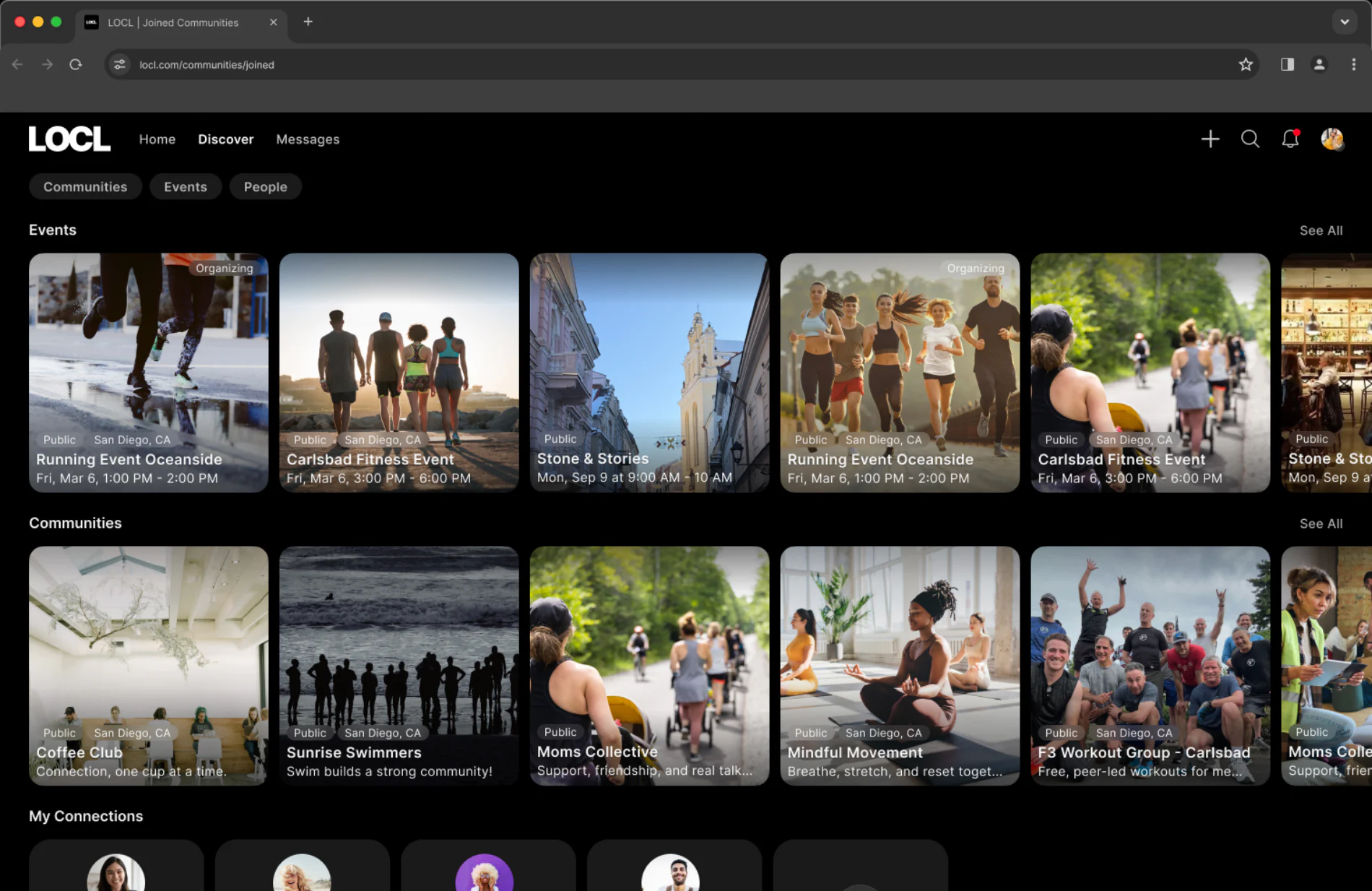
Discover · Mobile
Discover · Desktop
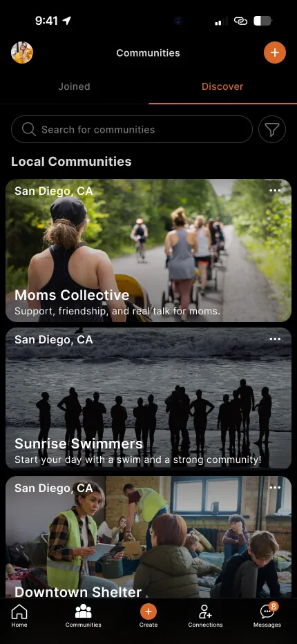
Discover. Browsing what is nearby. Communities, Events and People stay as the same three filters in the same order. The card is the shared unit: one column on mobile, a grid on desktop, with the cover image, locality and visibility badge reading the same in both.
03 — Who We Designed For
Three people using the same product differently
LOCL serves distinct participation roles. Designing for a generic "user"
would have collapsed them into one experience that served none of them
well. Understanding the differences shaped every navigation, governance,
and discovery decision.
Organizer
The Community Organizer
Creates and runs a local community, an event series, or a recurring
gathering. Their product is the community itself, not the feed. They
need tools that respect the work of managing a space: visible roles,
moderation controls, and creation flows that set their community up
to last, not just launch.
Governance accessible during everyday participation, not buried in settings
Event and registration flows that reduce organizer uncertainty
Ability to define who joins and how, from the very first step
Participant
The Active Member
Already part of communities they chose. Returns for updates, events,
and connection with people they know. They don't want to browse every
time they open the app. They want to land somewhere that shows what's
happening in their communities without noise from everything else.
A clear home anchored to the communities they joined, not a global feed
Fast access to upcoming events and community updates
Participation that doesn't require navigating complex menus to reach
Discoverer
The Casual Discoverer
Browsing without commitment. Evaluating whether something local is worth
joining. They need to quickly read a community (mission, leadership,
location, activity level) without being dropped into a feed before
they've decided anything. The wrong first screen loses them entirely.
Community identity and purpose visible before any participation is expected
Discovery scoped to location and interest, not algorithmic reach
A low-commitment path to evaluate a community before joining
04 — What I Owned
Designing the system, not just the screens
01
Product Structure & Navigation
The separation between Discover and Joined modes, tab architecture,
information hierarchy, and navigation behavior across all platforms
and surfaces.
02
Core Community Surfaces
Feed, about, members, affiliates, media, posting behavior, and
identity systems. The structured spaces that define how each
community feels and functions.
03
Governance & Trust Flows
Moderation, reporting, join requests, role systems, permissions,
and visibility controls, treated as core product systems
rather than secondary admin features.
04
Event & Registration Systems
End-to-end event creation, registration flows, ticketing, check-in,
coupon and payment states, designed to reduce friction while
supporting complex participation scenarios.
05
Cross-Platform Design & Parity
Structural consistency across iOS, Android, and responsive
web, maintaining parity while respecting native platform
conventions and build realities.
06
Design-to-Build Artifacts
Component behavior contracts, state coverage matrices, parity
guidelines, interaction specifications, and reusable structural
patterns that reduced engineering ambiguity and accelerated delivery.
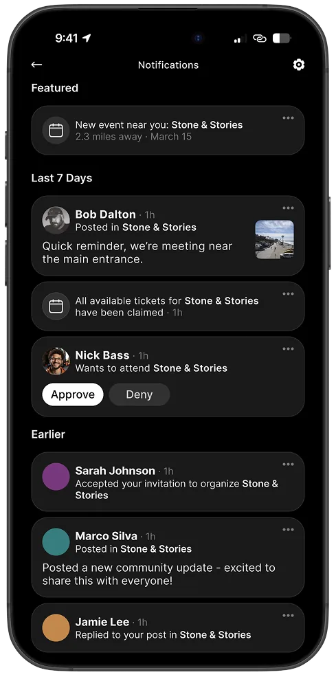
Notifications: activity and approvals
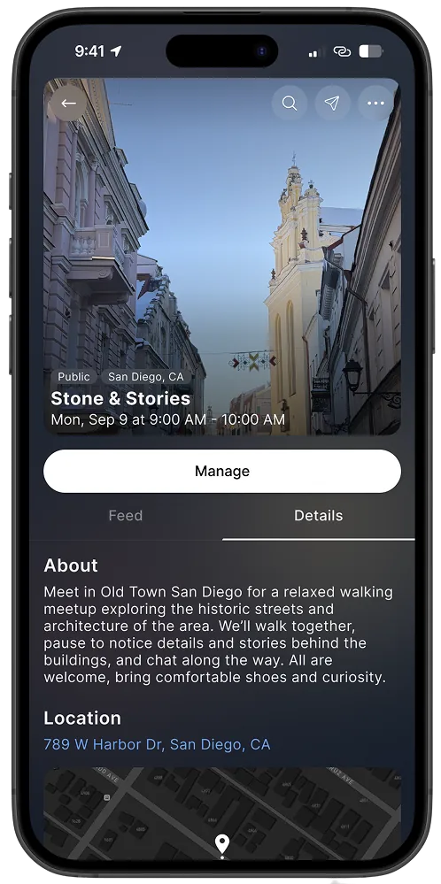
Manage event: guests and check-in
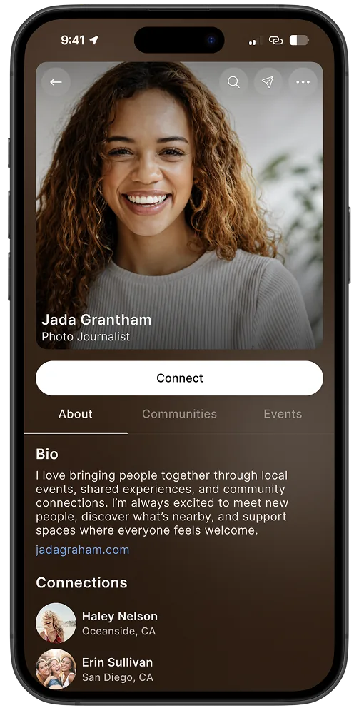
Profile: participation and context
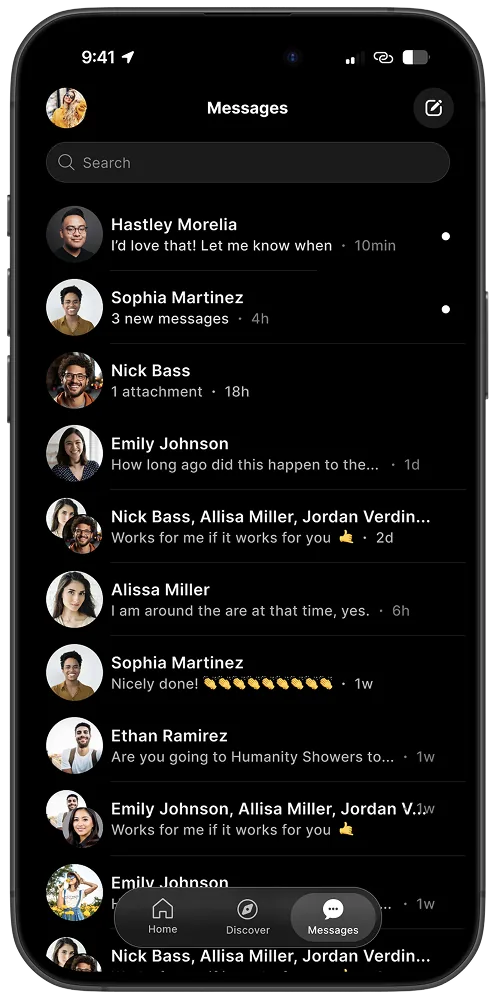
Messages: conversation list
05 — Core Problem
A system challenge more than a UI challenge
Community products rarely break because the interface looks bad.
Problems appear when the system stops supporting healthy participation
as communities grow. LOCL had to balance four tensions common across
social platforms.
Signal vs Noise
Local relevance disappears when global engagement mechanics
dominate attention. Discovery must stay bounded and intentional
to preserve the local signal that makes communities worth joining.
Discovery vs Belonging
Browsing and returning require different behaviors. The product
needed to support both without collapsing them into the same
feed experience or forcing users to navigate between incompatible modes.
Growth vs Governance
Communities scale quickly, but trust weakens when leadership and
moderation do not scale with them. Governance tools needed to feel
integrated, not bolted on after problems appeared.
Openness vs Safety
Removing all friction increases activity, but the right friction
protects long-term trust. Visibility controls, join requests, and
role systems exist because participation quality matters more than
participation volume.
06 — System Architecture
Designing around participation states instead of feed mechanics
LOCL is structured around two distinct behavioral modes: Discover for
exploration and evaluation, and Joined for commitment, participation,
and returning behavior. Rather than pushing every user through the same
feed experience, the system adapts based on participation state.
This allowed discovery to stay lightweight, joined communities to feel
persistent and relational, governance tools to scale naturally with
participation depth, and interaction patterns to stay contextual instead
of globally flattened.
What the system needed to support
Discovery without collapsing into infinite-feed behavior
Governance systems integrated directly into participation flows
Local-first relevance that stays bounded and intentional
Shared interaction systems across iOS, Android, and web
Community creation flows that reduced ambiguity and improved launch quality
Identity systems centered around participation and context, not follower metrics
Core system principles
Discover and Joined as Separate Behavioral Modes
Exploration and commitment have different psychological expectations and needed different UX behavior rather than a shared feed.
Governance Integrated Into Participation
Moderation, reporting, roles, and join systems were core product systems, not secondary admin tools added after the fact.
Communities as Structured Spaces
Communities were designed with dedicated surfaces for updates, context, media, members, affiliates, and governance. Not just a feed.
Cross-Platform Parity Without Identical Behavior
Patterns stay structurally consistent while respecting native platform expectations. Same logic, appropriately expressed.
System Architecture
Cross-platform desktop views
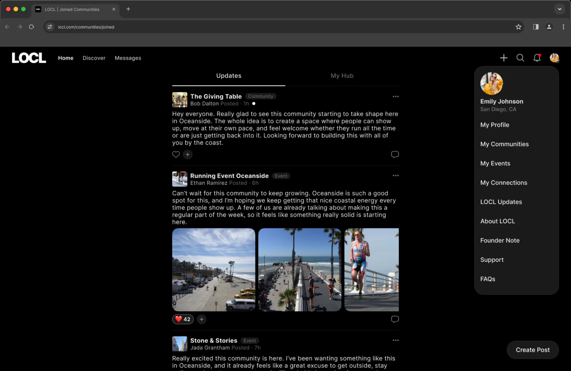
Navigation on desktop
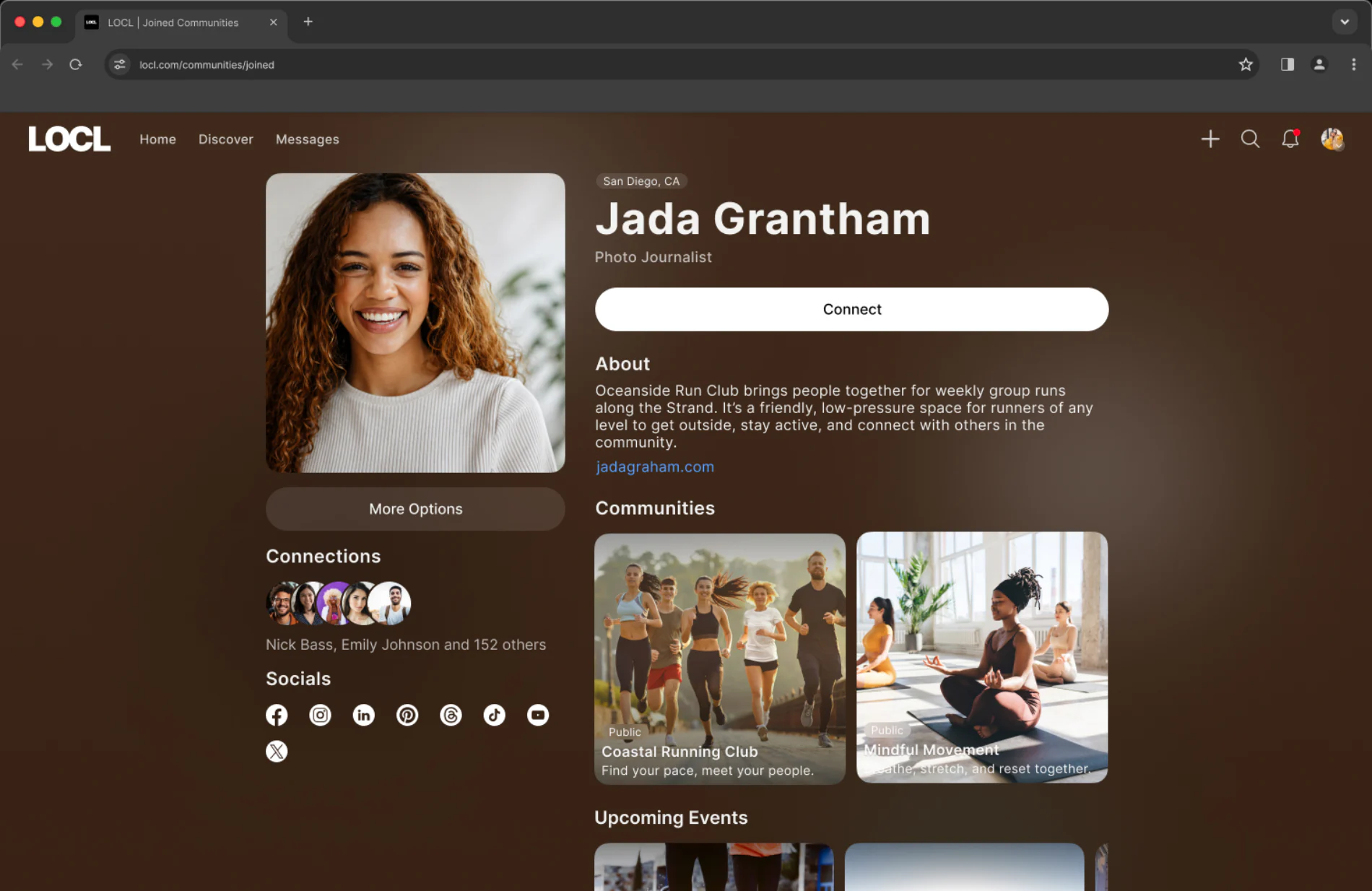
Profile on desktop
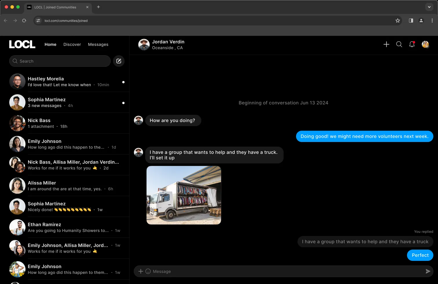
Messages on desktop
07 — Community Systems
Communities designed as living spaces
LOCL treats communities more like structured environments than content
channels. Each community organizes around dedicated participation
surfaces that help reduce feed overload while making communities easier
to understand and participate in confidently.
Community surfaces
Feed: updates and discussion
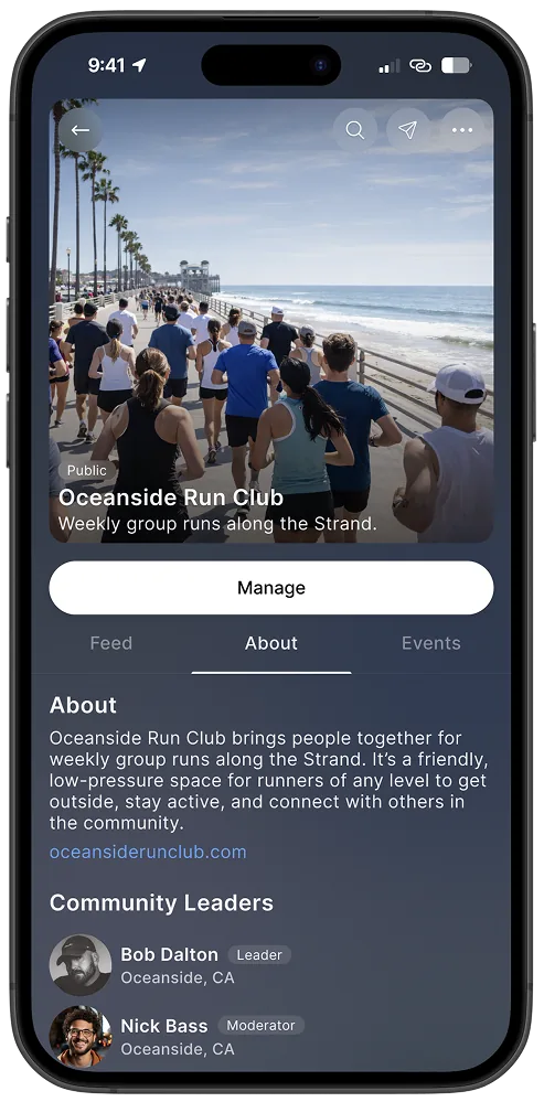
About: mission, leadership, and location
Media: shared photos and videos
Members: visible roles and participation context
Affiliates: related communities and partnerships
Events: community-anchored events and activities
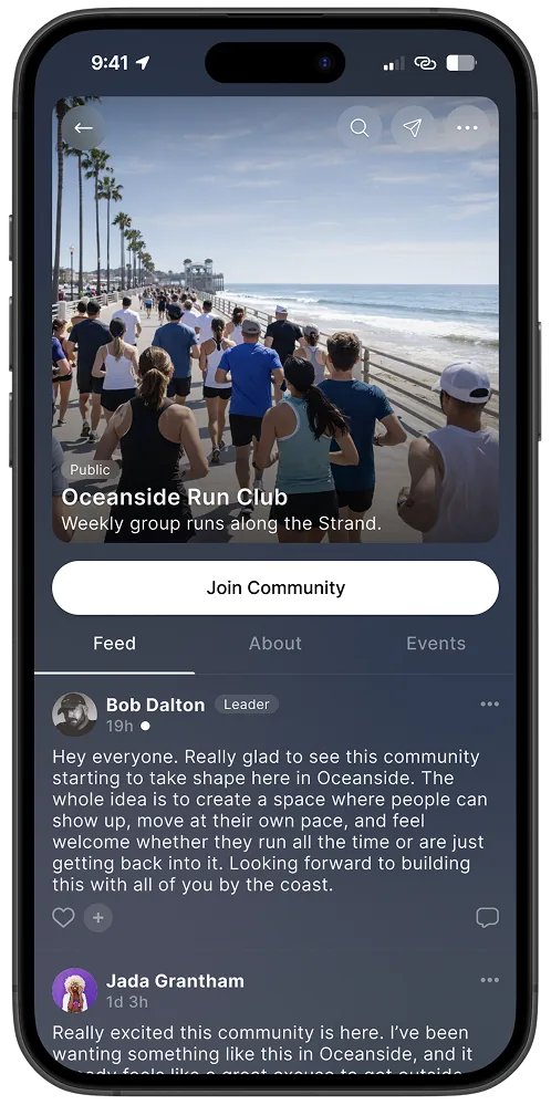
Community feed · Mobile
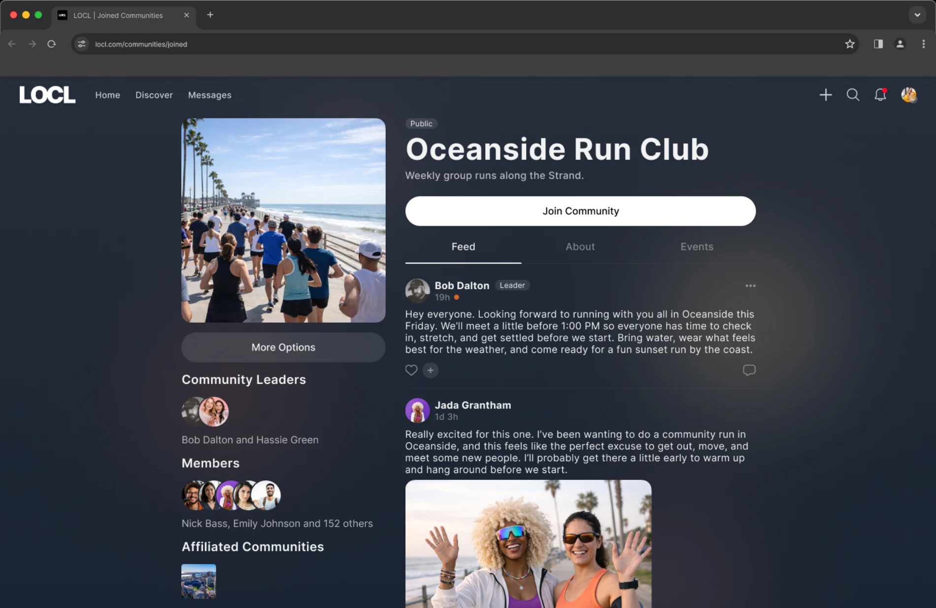
Community feed · Desktop
A community, on both form factors. Feed, About and Events stay the same three tabs in the same order on both. What changes is the surrounding context: on desktop the information that sits behind those tabs on mobile, community leaders, members and affiliated communities, is promoted to a persistent sidebar, so an organizer can see who is in the room while reading the feed.
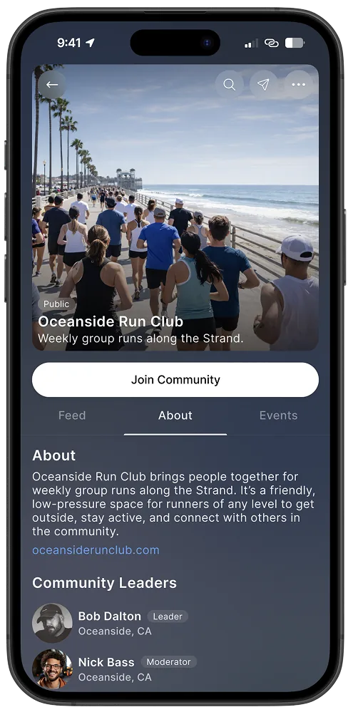
About: mission and leaders
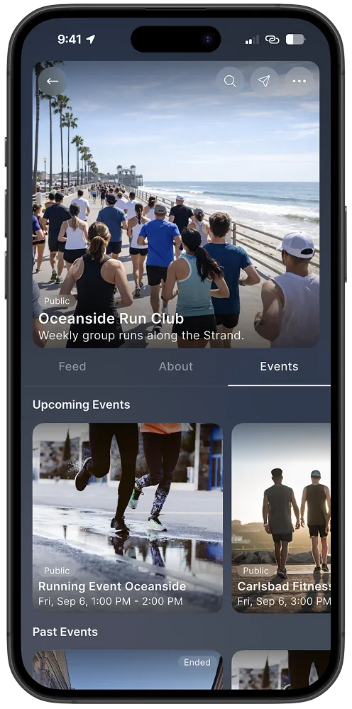
Events: upcoming and past
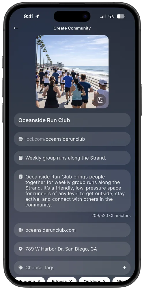
Create: name, category, visibility
Manage: governance entry
Community creation as a guided system
Community creation was intentionally structured to reduce ambiguity and
improve long-term participation quality. The flow guides organizers through
defining identity and purpose, anchoring locally, selecting tags and
visibility, assigning stewardship early, and inviting initial participation
immediately after launch. The goal was not maximizing creation volume. It was
improving community durability and clarity from the start.
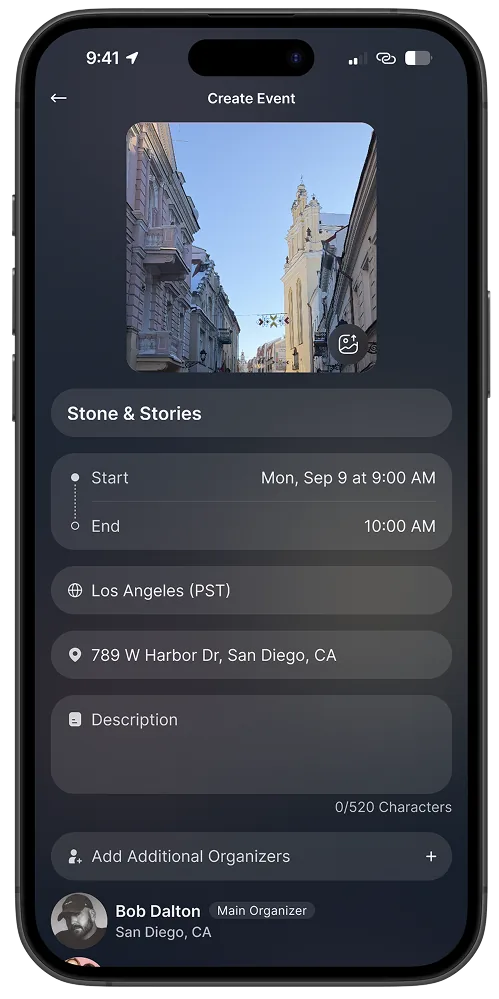
Event system
Events were designed as a complete participation system, not just a
creation form. From creation and registration through ticketing, check-in,
and post-event flows, every step needed to reduce organizer uncertainty
and increase attendee confidence.
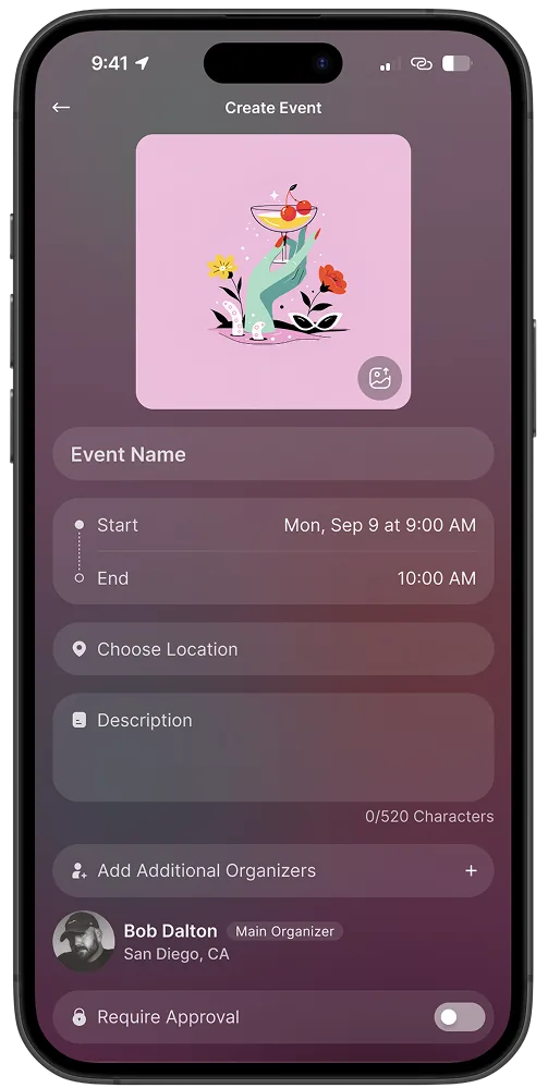
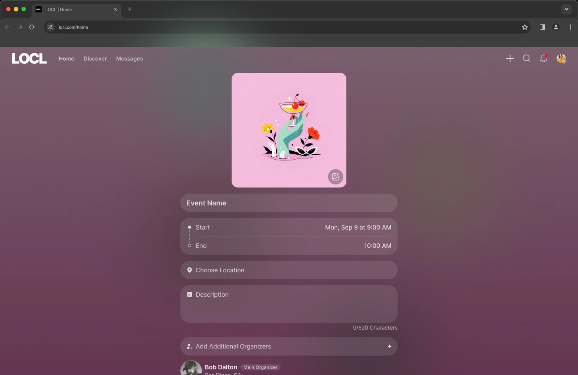
Create event, placeholder · Mobile
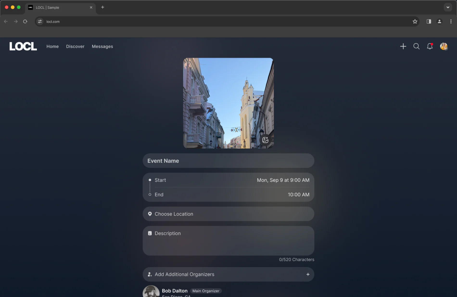
Create event, placeholder · Desktop
Creating an event. A sequential task, so the form stays a single column on desktop rather than spreading into two. The fields and their order are identical on both.
Dominant colour extraction
Every surface adapts to the content within it. The UI reads the dominant
colour from a community or event's cover image and shifts the background
to match. Each space ends up feeling like it belongs to the people who
built it, not like a template.
Cover image uploaded · Mobile
Cover image uploaded · Desktop
The same screen on both form factors once a cover image is added. The tint is pulled from the image itself, so the page reflects the event before it is even published.
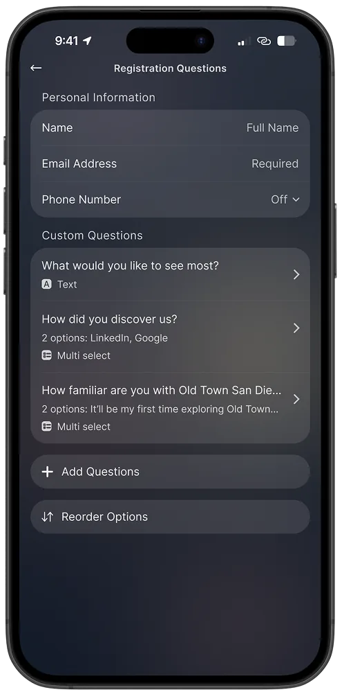
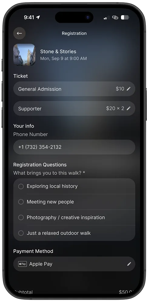
Registration questions
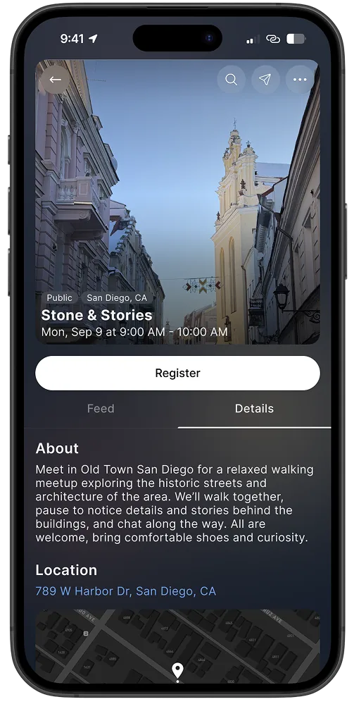
Register: ticket selection
Multiple ticket types
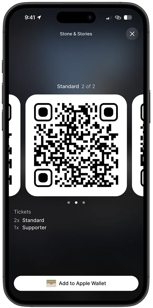
Tickets with QR codes
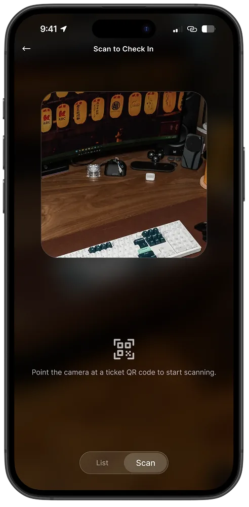
Check-in by QR scan
Governance & moderation
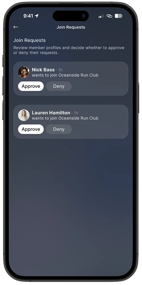
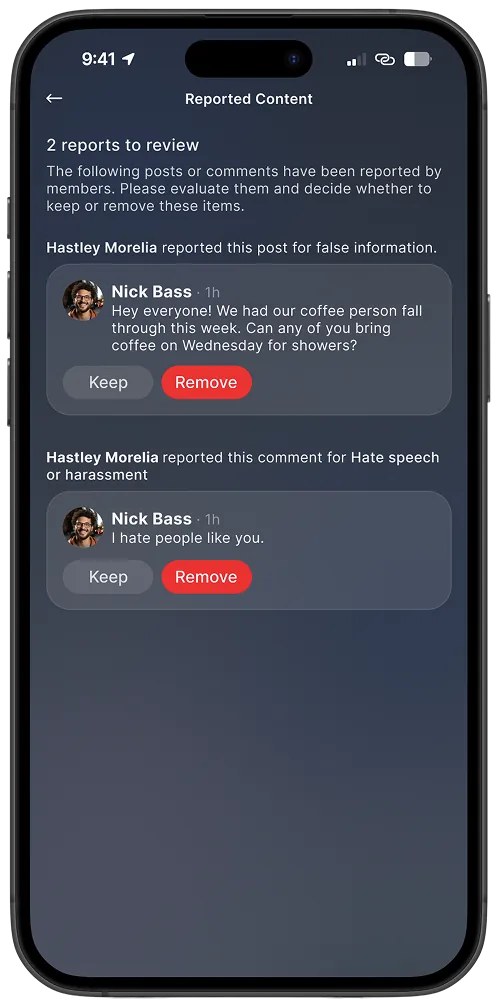
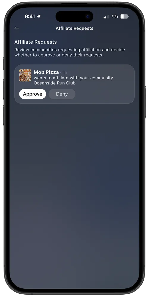
Governance was treated as a first-class UX concern. Moderation, reporting,
join requests, role assignment, and visibility controls were designed to
feel like natural extensions of participation, not hidden admin complexity
that only surfaces after problems occur.
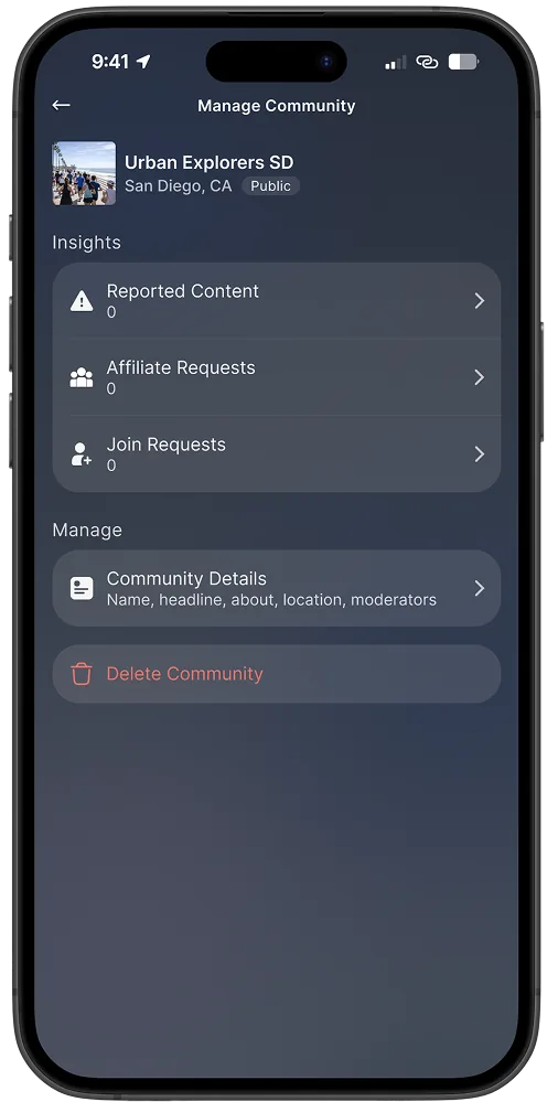
Manage community: insights
Join requests
Reported content review
Affiliation requests
08 — Research & Insight
Lightweight, strategic, and rooted in observed behavior
We started with patterns, not assumptions. Across products like Nextdoor,
Facebook Groups, Meetup, and Discord, the same issues appeared repeatedly, and
conversations with community organizers reinforced consistent needs.
Pattern Audit
Feed Collapse
Feeds eventually collapse communities into noise. Local relevance erodes under global engagement mechanics.
Late Governance
Moderation typically arrives after trust is already damaged. Admin tools remain hidden until communities break.
Onboarding Mismatch
Onboarding rarely reflects how communities actually form in real life. Communities form through participation, not setup flows.
Organizer Signals
Clarity Over Breadth
"Who is this for?" should be immediately clear. Ambiguous community identity slows trust-building and participation.
Leadership Dignity
Leadership and moderation need dignity, not hidden admin complexity. Visible roles build community confidence.
Guided Creation
Communities perform better when creation is guided rather than completely unstructured. Defaults that reinforce quality matter.
Design Principles
Trust Through Transparency
Communities perform better when roles, visibility settings, and participation expectations are clear from the start.
Contextual Relevance
Locality and purpose should always be visible in discovery. Generic feeds do not build the sense of belonging that sustains participation.
Intentional Friction
Join requests and visibility controls are not barriers. They are signals that a community has standards worth maintaining.
Key Insights
01
Communities succeed or fail based on trust, not feed mechanics
Hypothesis
Build strong discovery and feed mechanics, and participation will follow naturally.
Signal
Early communities with visible leadership and clear roles had stronger retention than open-access communities with more feed activity.
Response
Moved governance out of admin settings and into everyday participation flows: join requests, roles, and reported content became first-class UI.
Engagement volume is easy to produce. Long-term participation requires people to feel clarity, safety, and visible leadership before they see a feed.
02
Discovery works better when intentionally constrained
Scoping discovery to locality and purpose produces more meaningful results than open-ended social search. Relevance, not volume, builds confidence in what was found.
03
Governance is part of UX, not administrative overhead
Hypothesis
Moderation and role tools could live in a management panel accessed separately from the main community experience.
Signal
Organizers in early design reviews kept missing moderation events. They expected to see them in context, not in a separate admin section.
Response
Governance was woven into the community experience from the start. Join requests and reported content appear where organizers already are, not one layer away.
Moderation, roles, and join controls feel natural when woven into participation flows. Hidden admin panels create power structures that communities sense but cannot see.
04
Early structure exploration reduced costly late-stage pivots
Low-fidelity architecture work validated navigation systems, information hierarchy, and governance flows before visual polish locked decisions into place.
05
Private and unlisted communities outperformed public growth expectations
Hypothesis
Open, public communities would attract the most users and grow fastest in the early weeks.
Signal
In the first five weeks, private and unlisted communities showed stronger member return rates and sustained participation than fully public ones.
Response
Leaned into governance controls as a product feature: join requests and visibility settings were treated as trust signals, not friction to reduce.
The strongest early signal came from communities where organizers used governance controls. Participation quality drives adoption, not open access.
Early structure & decision exploration
The first working designs were built before any visual system existed.
Placeholder imagery and flat styling kept focus on structure, not surface.
Every screen captured a decision: how navigation modes would separate,
what belonged inside a community page, and how governance would fit
into everyday participation rather than a hidden settings menu.
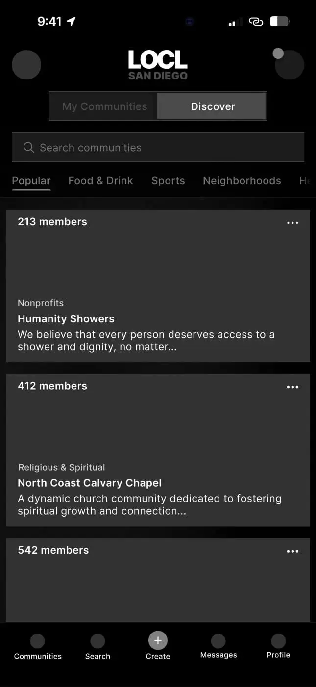
Navigation architecture: the root decision
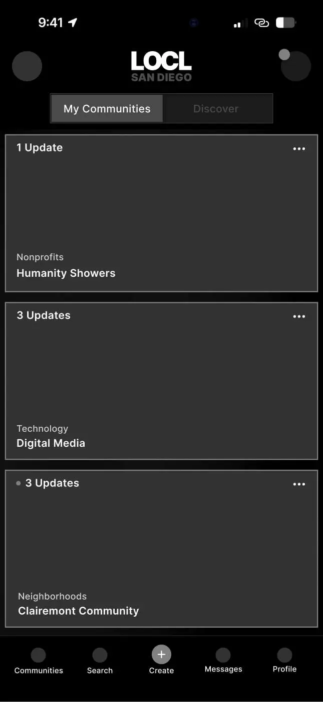
The core structural choice: separate Discover (exploration) from
My Communities (returning and participating) at the product root.
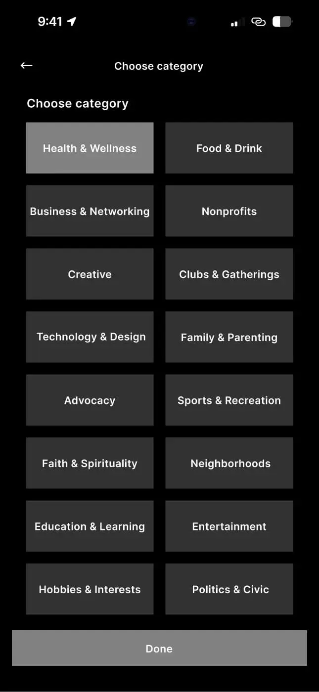
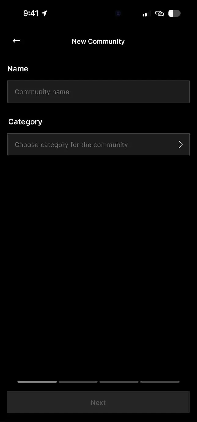
A single toggle. No shared feed. Community creation was placed one step
from the bottom bar, not buried in settings. Category taxonomy (16 types
covering everything from Nonprofits to Neighborhoods) was defined here
before any visual refinement.
My Communities
Discover
Category selection
Create community
Profile
Community page depth: five surfaces decided early
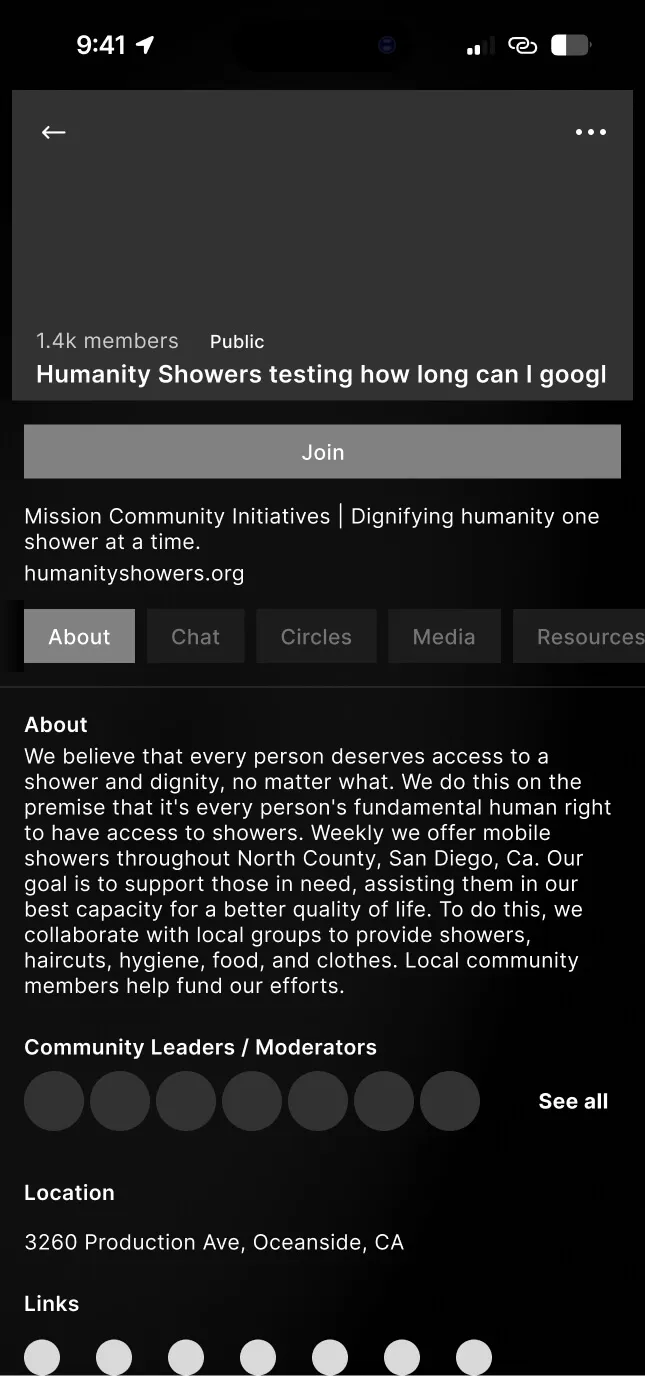
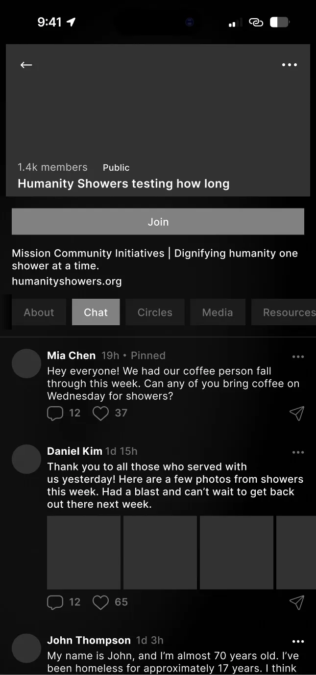
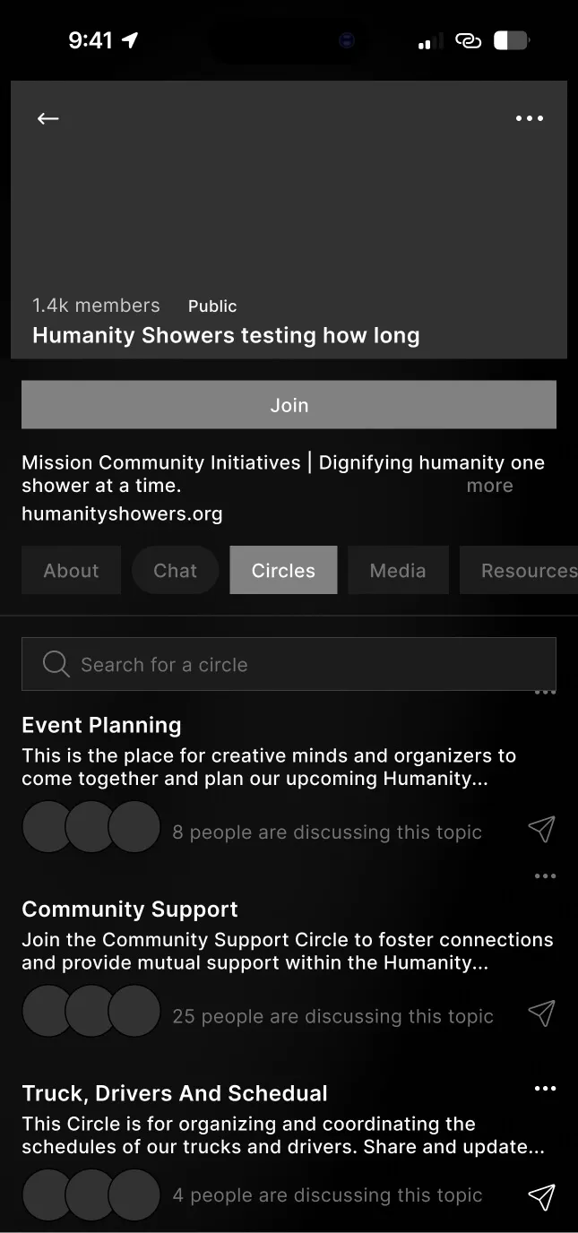
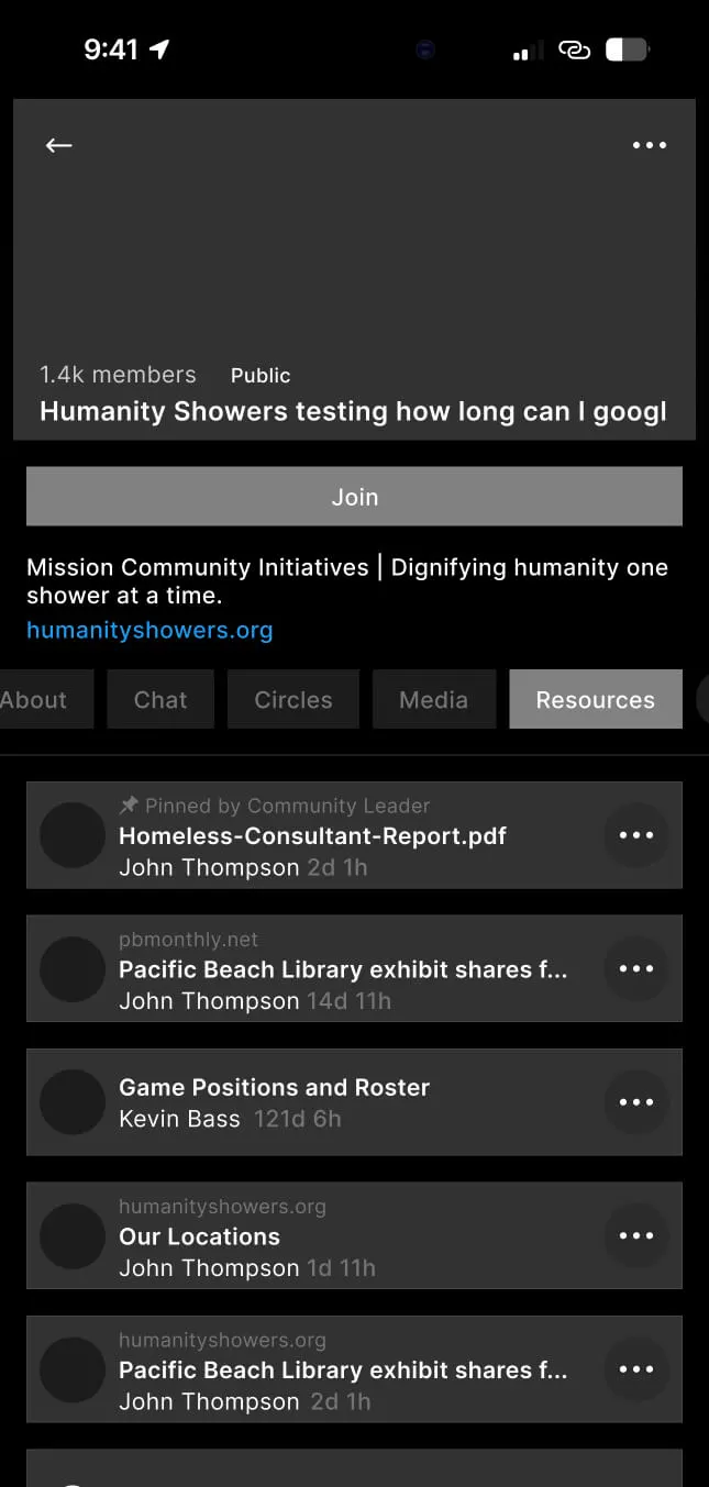
Each community was structured as a multi-tab space from the first
prototype: About, Chat, Circles, Media, and Resources. Giving communities
structural depth (not just a feed) forced decisions about what belonged
where before UI polish made those decisions harder to revisit. Governance
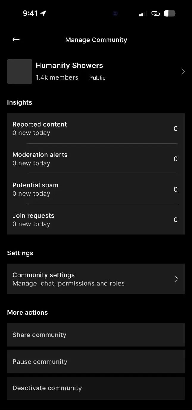
lived in a dedicated management layer from day one, surfacing moderation
alerts, reported content, spam signals, and join requests in a single
dashboard rather than scattered settings.
Community: About
Community: Chat
Community: Circles
Community: Resources
Manage community
Supporting systems
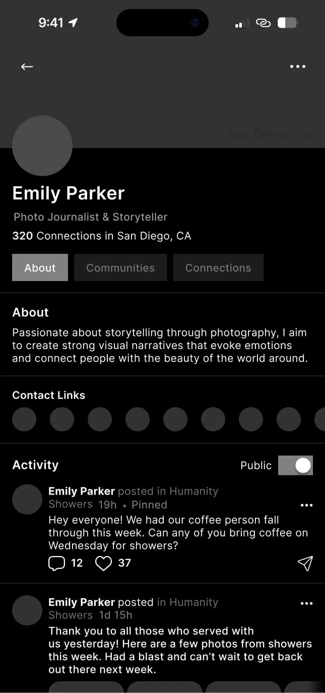
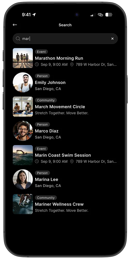
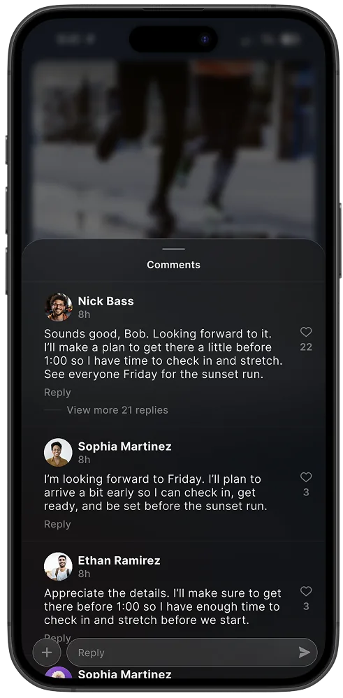
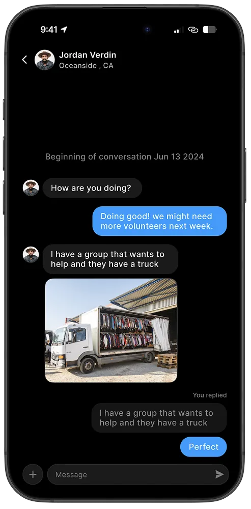
Search, connections, messaging, and profile were designed to work together
rather than as isolated features, all scoped to participation context and
local relevance.
Search results
Comments and replies
Direct message thread
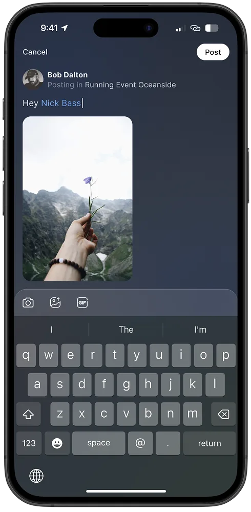
Post composer
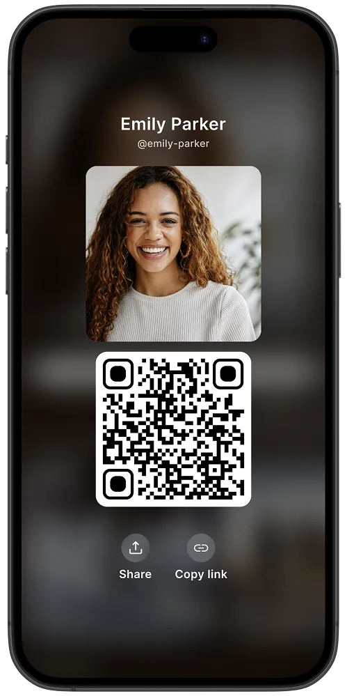
Profile ID
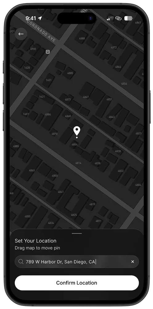
Location picker
09 — Product Evolution
From structural MVP to a visually alive V1
The MVP focused on getting the architecture right: navigation systems,
governance flows, community surfaces, and interaction logic. Once the
structure was validated through real usage, the product evolved into a
significantly more expressive visual system.
What the MVP established
Navigation anchored around a unified Home feed and a Communities tab with Joined / Discover toggle
Community pages structured around Feed, About, Media, Members, and Affiliates, using a content-first flat hierarchy
Orange accent color carried the brand across buttons, reactions, selected states, and interactive affordances
Flat dark black UI with no depth system, so structure was the primary visual language
MVP: structure established
V1: visual system introduced
What changed in V1
Orange accent dropped, shifting the UI toward a more modern visual tone
Navigation restructured: Home / Discover / Messages replaced the old five-tab bar with a cleaner, role-based structure
Discover became its own dedicated page, with Communities, Events, and People browsable independently
Linear gradients and circular gradient blobs pulling dominant colors from hero imagery introduced visual depth per community and event
Background blur applied to UI elements, creating layered depth and separating content surfaces
Home restructured into Updates and My Hub, separating participation context from the activity feed
Significant accessibility improvements to contrast ratios, touch targets, and semantic structure throughout
10 — What We Changed
The decisions we made, then unmade
The MVP was a structural foundation, not a finished product. Two decisions
changed significantly as real usage revealed what the structure couldn't support.
01
Five tabs became three
The MVP launched with five navigation tabs: Home, Communities, Events,
Messages, and Profile. Each tab made sense as a feature. As a navigation
system, they created a problem: people couldn't consistently identify
which tab to use for finding something new versus returning to communities
they'd joined. We ran 1-1 interviews to understand how people were
actually moving through the app. The pattern was clear. Navigation needed
to map to behaviors, not to features.
Navigation structure: MVP vs V1
MVP: 5 tabs
Home
Communities
Events
Messages
Profile
Each tab mapped to a product feature. The navigation answered "what is in here?" not "what am I trying to do?"
V1: 3 tabs
Home
Discover
Messages
Three tabs. Three behavioral jobs: return to your communities, find something new, communicate. Profile moved to a corner, a setting rather than a destination.
What We Had
Five-tab structure, one tab per product feature: Home, Communities, Events, Messages, Profile
What We Saw
1-1 interviews revealed people couldn't consistently identify which tab handled discovery vs returning to joined communities
What We Changed
Collapsed to three tabs anchored to behaviors, not features: Home, Discover, Messages. Events folded into Discover and community pages.
Result
Each tab has one behavioral job. People know where they're going before they tap.
02
Community pages led with communication before context
Early community page architecture was built around Chat as the primary
surface, with Circles (sub-threads) and Resources alongside. It was
a reasonable start. Communities are about discussion, and discussion
needed a home. But it created a problem for the experience of joining
something new. Someone arriving at a community for the first time landed
in an active discussion with no context about who the community was,
what it stood for, or whether it was the right place for them. The
community was asking for participation before it had earned it.
What We Had
Community pages led with Chat. The primary surface was the discussion feed, with Circles and Resources alongside
What We Saw
New members arriving mid-discussion had no context: who runs this, what it's for, whether it's local enough to matter to them
What We Changed
Restructured community pages to lead with About: mission, leadership, and location visible before any discussion is expected
Result
Communities can introduce themselves before asking for participation. Joining happens from a position of understanding, not confusion.
11 — Engineering Collaboration
Senior design is buildable design
Flutter enabled cross-platform consistency, but it also raised the bar
for implementation precision. I worked closely with engineering to
reduce build ambiguity and accelerate delivery, creating systems that
stayed understandable and consistent across platforms, states, and
future iteration.
Component Behavior Contracts
Precise documentation of how every interactive component should behave across states, platforms, and edge cases. Not just in the happy path.
State Coverage Matrices
Explicit mapping of empty states, loading states, error states, and permission states to eliminate engineering guesswork at implementation time.
Parity Guidelines Across Platforms
Clear documentation of what must be consistent across iOS, Android, and web, and what can appropriately differ by platform convention.
Reusable Structural Patterns
Shared interaction logic, filter behavior, action hierarchies, and navigation structures that could be implemented once and applied consistently across the product.
Design decisions were shaped directly by performance constraints,
engineering feasibility, parity requirements, edge cases, and long-term
maintainability. Implementation structure became part of the UX system
itself, not a separate layer added afterward.
12 — Outcomes & Signals
Data used carefully and honestly
Metrics were used to validate system direction, not decorate the story.
The strongest signals came from participation quality, not raw volume.
Early Traction: First Five Weeks
+225%
User growth in the first five weeks. Organic growth from community-driven participation, not paid acquisition.
+221%
App installs over the same period, driven primarily by community organizers inviting participants.
+126%
Communities created in five weeks. Strongest growth came from private and unlisted communities, reinforcing the governance-first approach.
System Signals: As of January 2026
2,456 users across 53 countries and 680 cities
509 communities created with 4,992 community memberships
3,474 posts published across communities
System remained structurally coherent while supporting multiple community types and growing governance complexity
Cross-platform parity held across iOS, Android, and responsive web without structural fragmentation
Private and unlisted communities showed the strongest sustained participation, validating governance controls as a trust feature rather than a barrier
More importantly: the system remained structurally coherent while
supporting multiple community types, growing governance complexity,
cross-platform parity, and increasingly distributed participation
behavior. That coherence is harder to measure than a conversion rate.
And more durable.
13 — Reflection
Community products are trust systems
Working on LOCL reinforced something I already suspected: community
products succeed or fail based on trust, participation, and how well
the spaces are looked after. Feed mechanics alone don't get you there.
What Stayed True
Governance is part of UX, not administrative overhead. When it arrives late, trust is already weakened
Discovery works better when bounded. Local relevance degrades under open-ended mechanics
Community identity needs visible structure and context. Ambiguity slows participation and belonging
People need clarity to join, safety to stay, and leadership to scale
Buildable systems scale better than visually impressive but fragile flows
What I Took Forward
Cross-platform parity comes from shared behavioral systems, not identical UI. Consistency is structural before it is visual
Early lo-fi work reduces costly pivots. Architecture decisions made after visual polish are expensive to revisit
Empty states and edge cases are not afterthoughts. They reveal the quality of a system's thinking
Systems that support participation quality over volume are harder to build and harder to break
LOCL is still early, which has been useful. Without heavy marketing
pressure, the product had space to validate whether local-first systems
could grow through participation quality rather than engagement
optimization. The answer, so far, is yes.
Experience the Product
See it in context
LOCL is live across iOS, Android, and now directly in your browser.
Experience the community system in context at locl.com.